Time to take everyone behind the scenes a little bit.
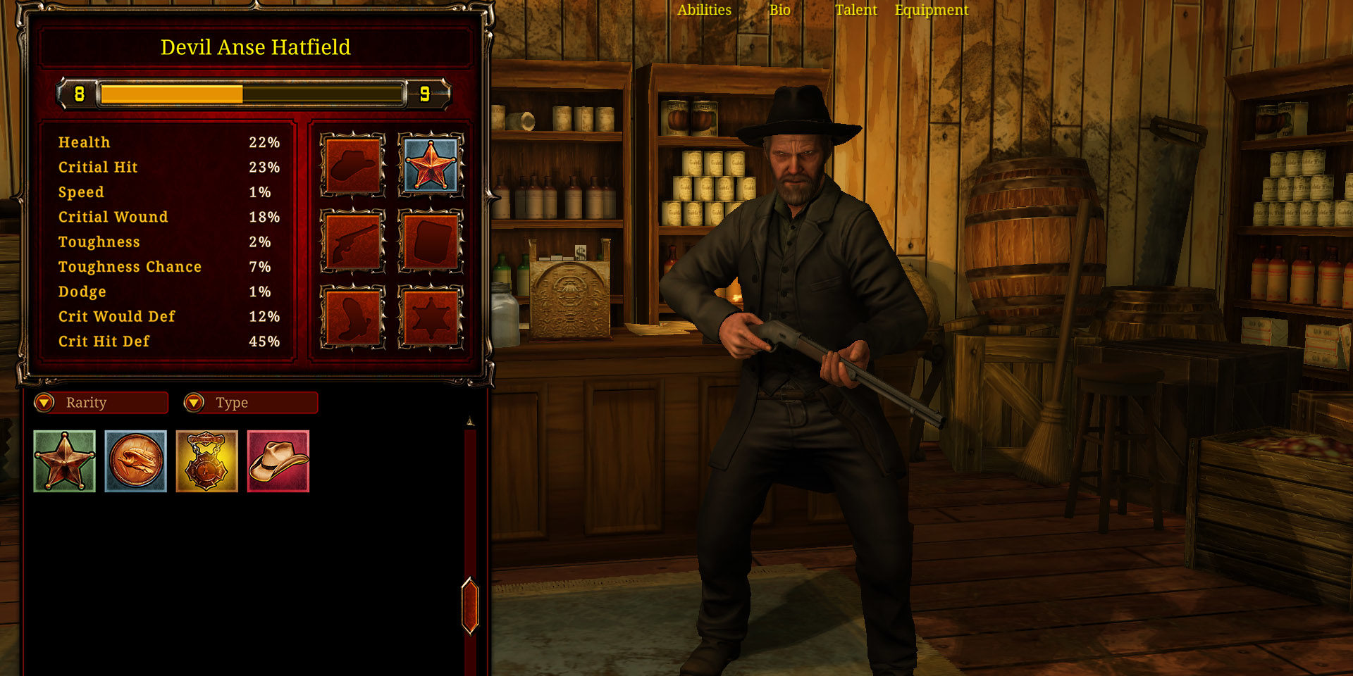
We recently overhauled the Character UI including Talents, Items, Bio and Abilities. When we started we had a basic idea for the UI to get it up and running quickly. Part of the issue was as the in level game has matured, these UI areas hadn’t.
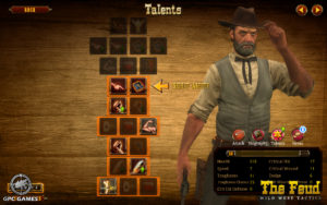
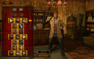
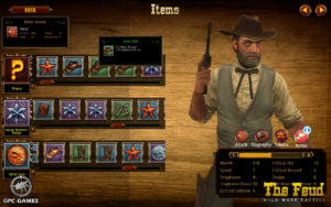
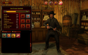
We’ve included a few shots of before and after here to give everyone a little behind the scenes. As you can see in the new UIs the backgrounds have gone full 3d, you can see all of the character and in terms of the items UI it’s a lot more familiar to what a PC gamer is used to seeing. Our original items UI was a product of doing a lot of mobile game work and it showed.
Before:
After:
Before
After
Along with the visual and layout overhauls we also updated the way abilities are displayed and added some great visual effects to make choosing talents more exciting.
The item UI also changed the game opening up more item slots and the potential for “Sets” of items in the future.
